Saturday, May 15, 2010

Recent Paintings

The reason I've have been finding so many old pieces is because we are moving to a different apartment and I have been cleaning house. Recently, I found this painting from Fall 2009, I believe. Our assignment was to recreate a master's painting. I did the prodigal son by Rembrant. My teacher did not write down any comments about it, however, I know there are some things that need to be fixed. We'll find out by the time portfolio preview comes around.


This assignment was an allegorical self-portrait. It was inspired by the movie the Emerald Forest. REALLY GOOD, it can be seen on youtube.com. I'm not crazy about the idea, but I don't really have a clue of what else I would do. I like myself the way I am and I can't imagine other ways people see/think of me. Maybe this assignment was a bit too abstract for me. I will get a better scan of the photo when my teacher grades and returns it.

I really love painting. It gives a great sense of accomplishment because you get out of it what you put into it. I put a lot of time and effort into my paintings. I would like to paint more often and become faster at it. These paintings took me probably 20+ hours.

Thursday, May 6, 2010

Going through the dusty attic of my mac.

I was cleaning and organizing my folders and what not and I found some old stuff that I am not completely sicked by. You can definitely see how much I have improved!

I did this for a christmas card for bloom 415 Christmas 2008. Charcoal and colored in photoshop. This one I like the least. (barfs)


Just an abstract sketch that I planned to do something with, but never did.


This is from my Advanced Digital Painting class, I think I did a year ago, give or take a few months. My attempt at comic book style. Eh..It's "aight."


This I did for a chemistry class I took. If I could go back I wouldn't have taken it. I took it for an easy A but now I wish I took something a little more close to my field. It was fun though, Ms. Wax would be so proud of me! :D

Sunday, May 2, 2010

A Greeting Card Adventure

This week my sponser and I were discussing different long term projects to start on for the second half of the quarter. I was thinking of something a little more on the illustration side of things because I’ve gotten pretty burnt out on the graphic logos.
She suggested greeting cards and I was psyched! She has connections with a company that does an 8 pack variety on life celebrations and funky occasions. This is cool because my vision was to do out of the ordinary greeting cards. Birthday and anniversaries are so over done.
So I started sketching, coming up with ideas, and this first set is a couple’s theme but with birds.

I was envisioning illustrations on the front, with no text and on the back/inside just one line that can explain it all. I might need help on my wording. But for the first sketch I was thinking “Go for it.” Two birds on a telephone wire, and one wants to “ask the other out.” A silohuette on a orange to yellow sunset background. Quirky but sweet. Encouraging type of card.


This second sketch could be for a new couple, “Not in Public, Please?” Illustrating the PDA that comes with new couples...?
The reference photo I used had two pidgeons, however, I wanted to change it to Chukor Partridges.


The next illustration, “ We all have our shouting matches,” is for a couple who got into a fight. To help make up. Two birds of the Love Bird species.


The last sketch in the series was actually my first idea, and the whole idea of a couples theme was based on this one, it might have to change or I was thinking of adding engagement and marriage, or “new nest” in between.
“Congratulations Mommy and Daddy”


I haven’t heard back from my supervisor, so we’ll see what she thinks about these ideas. My next idea for another theme will be doggie cards for situations like “new puppy,” “old dog,” and silly situations like, “pooping in public.”
I am thinking of doing these in color pencil on some kind of fancy craft paper. Kinda like my friend Cora Seymour


... We’ll see.

Baseball Prospect Guide...Again..Still

To create a graphic logo that can be used for both print and web. The logo must be simple, clean and kept to three process colors. It will need to easily translate to black and white for printing on promotional items.

This week, for the baseball logo, consisted of more revisions. The client really like the direction we were going in, but he felt that he asked me to put in too many details and wanted to simplify it. My sponsor suggested, playing with a few elements such as font size, simplifying the figures, and getting rid of one, baseball size and line weight.


First I played around with the size of the player and line weight. I also tried some pathfinder tricks and made the outline of the baseball incorporate the batter figure. I tried making the type red instead of outlined and I really think that helped the design A LOT. Just changing that aspect made it really simple.


Then I took simplification to the next level. First I took out the outlines all together and did ball, stripes and text with a red background. I then tried taking out the stripes, and put them back in and took out the player. After this, I took out both elements for the next design, and really simplified it with just baseball and text.


I really like the super simplified versions. The client is on a tight schedule now and needs these Monday, the beginning of week 5. It seems like I have been working on this for an eternity now, but I think it is out of his indecision rather than my execution. We’ll see what he likes.

UH OH! As I am posting this, I just noticed, I have been using a CMYK red, and it is A LOT different on the web than on my Illustrator preview. OOPS! I'll fix when it comes to the final though. :D

Thursday, April 29, 2010

Avatar Disappointment

So last night, I watched Avatar, and it reminded me that I wanted to research the concept art. I found that a book called "The Art of Avatar" is now available.


Do yourself a favor, don't buy it! For $30, there was not much work put into this book. I was expecting a vast array of drawings and paintings, especially with all of the elaborate environments and creatures that were featured in the movie. But...NO. It seems like to me they decided to create the concept art AFTER the movie was made so they could sell it for profit. There were a lot of cheesy photo composites and several times the art work was printed in very poor resolution. I think even some of James Cameron's drawings were put in there. They are BAD! With all that said, there were a few really good sketches and what looks like charcoal pieces. I have uploaded some pictures of what I thought were pretty good. So just save your money and enjoy what I have put up for you.


Nike of Galleria

For this project, the idea was to take a famous work of art and change something about it to convey a modern message. I had a few ideas, but my best was to take the Nike of Samothrace, or Winged Victory and put her in sexy lingerie to make it look like one of the Victoria Secret "Angels."


I combined these two ideas, added a little charcoal and got this:


The hardest part about this project is finding a work of art you can use. Then coming up with a clever idea. The Nike is one of my favorite works from this period.

Tuesday, April 27, 2010

Internship with Bloom 415

I have recently taken on an internship with Bloom415, and we are 3 weeks in. It's been a doozy, but fun!
The Objective was to create a graphic logo that can be used for both print and web. The logo must be simple, clean and kept to three process colors. It will need to easily translate to black and white for printing on promotional items.

CLIENT VISION: I would prefer clean, professional look...my vision: a small version of a field with Baseball Prospect Guide spread out near the home run fence? White with red seams for ball is a must! Would like a "baseball" (image) in the "o" of Prospect, if possible.


With this in mind, I started with some pencil sketches and picture references of baseball fields. I was trying to keep it simple and graphic of course, but with an illustration-like spin on the design. The graphic design teachers don't like it when we illustrate–I do not really know why–no one has complained yet.


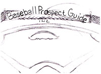
I wanted to get some dynamic views of dramatic angles, and interesting text placement. At the time, I thought sketch #2 and #7 were the most interesting, however, the client chose the simplest, sketch #1! When I look back, I still like the other, but I agree that #1 is the simplest and strongest.


I have trouble choosing the right font, but my sponsor helped me out on this one. She chose a font for me to use. I experimented with different fonts, but the one she chose was the best. I hope to get better at my font finding.


When I revised sketch #1 in Illustrator, I added a flying baseball in the "o"; of prospect. The client really liked this and wanted to explore it further. I came up with some baseballs with swooshes, that were vintage looking. Always keeping an illustrative aspect to it. (I want to be the graphic designer who illustrates!)


I also started looking at baseball pictures at iclipart.com and I was getting some inspiration. I decided to add in a figure and a bat. The client really liked. It's very interesting–every design I was sure the client would like, he always surprised me and picked another.


One thing I would like to point out about working in the real world: In school I usually create a few sketches before my teacher sends me off on completing the final project. For this first project, I have gone back to the drawing board six times, not really starting from scratch, but just revising. I notice that I am definitely spending more time on the sketches rather than the final project.