I have recently taken on an internship with Bloom415, and we are 3 weeks in. It's been a doozy, but fun!
The Objective was to create a graphic logo that can be used for both print and web. The logo must be simple, clean and kept to three process colors. It will need to easily translate to black and white for printing on promotional items.
CLIENT VISION: I would prefer clean, professional look...my vision: a small version of a field with Baseball Prospect Guide spread out near the home run fence? White with red seams for ball is a must! Would like a "baseball" (image) in the "o" of Prospect, if possible.
With this in mind, I started with some pencil sketches and picture references of baseball fields. I was trying to keep it simple and graphic of course, but with an illustration-like spin on the design. The graphic design teachers don't like it when we illustrate–I do not really know why–no one has complained yet.

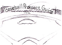
I wanted to get some dynamic views of dramatic angles, and interesting text placement. At the time, I thought sketch #2 and #7 were the most interesting, however, the client chose the simplest, sketch #1! When I look back, I still like the other, but I agree that #1 is the simplest and strongest.


I have trouble choosing the right font, but my sponsor helped me out on this one. She chose a font for me to use. I experimented with different fonts, but the one she chose was the best. I hope to get better at my font finding.


When I revised sketch #1 in Illustrator, I added a flying baseball in the "o"; of prospect. The client really liked this and wanted to explore it further. I came up with some baseballs with swooshes, that were vintage looking. Always keeping an illustrative aspect to it. (I want to be the graphic designer who illustrates!)


I also started looking at baseball pictures at iclipart.com and I was getting some inspiration. I decided to add in a figure and a bat. The client really liked. It's very interesting–every design I was sure the client would like, he always surprised me and picked another.
One thing I would like to point out about working in the real world: In school I usually create a few sketches before my teacher sends me off on completing the final project. For this first project, I have gone back to the drawing board six times, not really starting from scratch, but just revising. I notice that I am definitely spending more time on the sketches rather than the final project.


No comments:
Post a Comment